- Home
- /
- Case Studies
- /
- Pannaiyar
Pannaiyar Foods
An Artistic Pack that Caught attention in UAE Market
One don’t need to travel to India to discover Indian cuisine, Indian food has made its trademark across the world. People living in US, Canada, Singapore have Indian restaurants that offer meals with rice, millets, poha etc. Indian spices add a great aroma and taste to the dishes which has captured the huge market of Indian food lovers. No matter the area, people love to choose basic staples of Indian cuisine. Urad dal, toordal, moong dal, rice, bajra, wheat, tamarind are the main staples in Indian cuisine.
Brand
Pannaiyar
Scope
Brand Strategy, Brand Name and Packaging Design
Result
BRAND SUCCESSFULLY LAUNCHED BEFORE DIWALI, AND THERE IS A GOOD RESPONSE BY CUSTOMERS.
Challenge
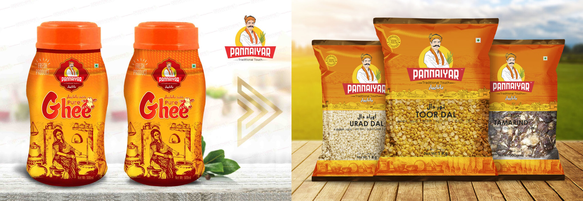
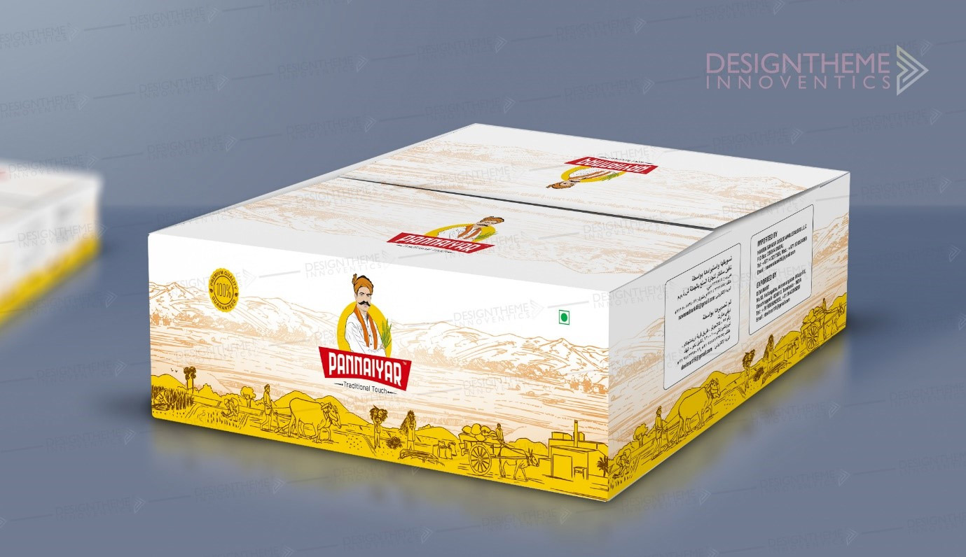
Every other brand talks about farming, farm to fork, or focuses on farmers, they donot want to be another brand in the market. Caricature was a part of the logo and that had to stand out so people recognize the brand and brand colors. They were very particular to use orange as the main color. The space to design the graphics was very limited yet to bring in the window or see through packaging where the product is visible. We have less space to bring in the art into the packaging. That was a quite tricky task. The product was planned to be sold at UAE market.
Mr Naveen from Tiruchirapalli approached us through a common contact looking at our previous work on art and we bringing art to life through packaging design inspired him a lot. We at Designtheme were glad to work on the concept. He wanted unique packaging design yet to be a transparent window packaging where the product needs to be visible.
Solution
The design should speak about Indian culture and choosing the right Indian staple food. We artists worked on the landscape, farming scene that plays well in the background, a sketch that depicts Indian culture. The Bold color Orange stands out as a part of the logo and the packaging.staple food. We artists worked on the landscape, farming scene that plays well in the background, a sketch that depicts Indian culture. The Bold color Orange stands out as a part of the logo and the packaging.
Result
Tremendous feedback from UAE market, as the product in the shelf stands out. The caricature of Pannaiyar who is the head of the Mill showcases the culture of Tamilnadu. The staples stacked in this bright packing were creating buzz and soon caught attention in major stores in UAE.


