- Home
- /
- Case Studies
- /
- AMK Rice
AMK Rice Bags
Creating a brand mascot for AMK Rice Bags
AMK has been a very recognized brand of rice manufacturers and sellers in India. They have been in this business for generations now and upgrade their technology regularly to deliver quality products to their customers. They reached out to Design Theme to help them design a mascot for their upcoming product.
Brand
AMK Rice Bags
Scope
Mascot Design, Packaging Design, Brand Positioning
Result
Brand successfully launched before Diwali, and there was a good response by customers.
Challenge
AMK planned to launch an existing product in a new packaging. The process of packaging was to be executed by implementing their in-house Korean technology and machinery. But before they started, a design had to be finalised ensuring they retain their brand positioning in the market.
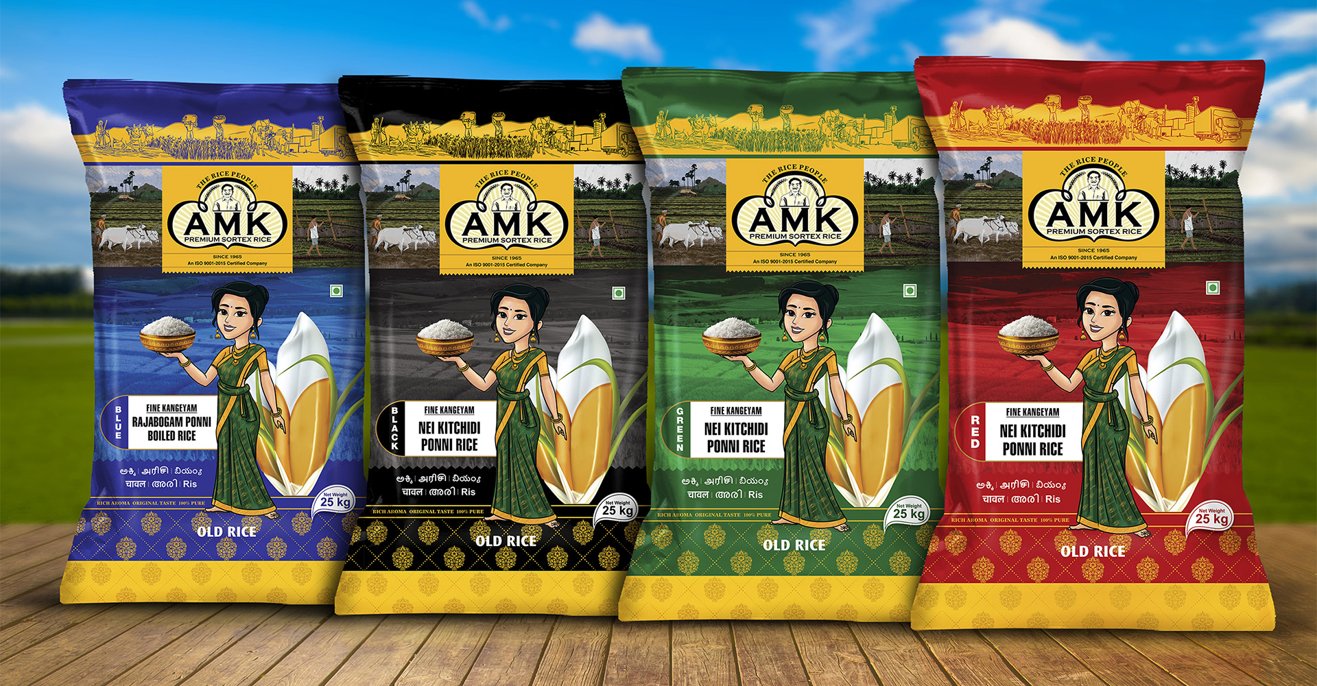
In a short span of time, we were required to come up with a new design for the package. Ideating on the design, we knew we had to implement certain aspects of the brand recall factor to ensure it clearly conveyed the message. These factors included coming up with a new design without altering the existing logo, creating a mascot that would help the client stick to their established brand identity, providing a competitive edge in the market, and ensuring the design retained its impact even when other colours for other varieties of the product were applied to it.
Solution
As a firm that believes in creativity being at the forefront of every industry to evolve, the team at Design Theme was thrilled at the idea of showcasing the ‘old and trusted’ in a new box. Having worked with indigenous brands before we analyzed the prime focus here was to craft a design that justified AMK’s objective to deliver quality rice products directly from the fields of Tamil Nadu wrapped in a packaging that helped it sustain its properties.
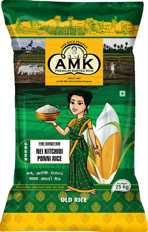
At this step, we used the brand logo in the design to ensure high brand recall value in the market. Since AMK has been in this industry for decades, they insisted on using the founder as the mascot. However, our package design expertise came into picture when we concluded what exactly would help them stand out from their contemporaries- a charming South Indian woman with a bowl of rice in her hand.
The brand mascot was meant to represent a ‘provider of food and nourishment through grains, ensuring the meal is complete and perfect. Serving food with a smile, the mascot on the packaging is a south Indian lady belonging to a farmer’s family. Considering the rice bags are marketed mainly in Tamil Nadu and the rest of India, the creative communicates agriculture and the hard work farmers put in to ensure these nourishing grains reach as many families as possible
The idea did not just come to us through brainstorming. To get a better understanding of the perfect mascot that the consumers would resonate with, we took a visit to the farms and the sites where the packaging of these rice products from AMK was carried out. The authenticity had to reflect through the beautifully designed creative, and reach the target consumers through online or brick and mortar stores.
Result
The creation of a bespoke brand mascot that the consumers could resonate with, had left AMK content, while we were elated with the response received. Our tailormade designing solutions had achieved its target of being visually appealing and achieving competitive edge in the market with all the attractive elements that were customized such as logo positioning, colors, and mascot.


