- Home
- /
- Case Studies
- /
- Studio Saarang
Studio Saarang
Exemplifying Best practices in designing a Brand logo for Architectural firm
Every community is defined by its unique architecture. When you think of an iconic monument, a charming skyline, or high-rise buildings, they are defined by their marvelous architecture. Similarly, a logo is an architecture for a company. A great logo can potentially help the company become a household name and paint a permanent picture in the viewer’s mind
Brand
Studio Saarang
Scope
Brand Architecture, Brand Logo
Result
Visually representing sound that aesthetically conveys the meaning.
Overview
Studio Saarang is an architectural firm that specializes in combining ancient design principles with modern techniques. They use a lot of natural elements and sustainable modern-day materials. Saarang ensures that every building they create is unique, and thus wanted to convey this through a unique logo as well. Design Theme stepped in to help create the branding that creatively conveys the company’s story.
Brand architecture is essentially the way a company’s products, services, sub-brands, etc. are organized. An effective brand architecture follows customer-centric design choices like logos, colors, names, and symbols.
Brand architecture can help customers better conceptualize your brand and its services. That’s the reason it’s always done using the customer’s thought process. The better the customer’s relationship with the parent brand the more likely is for the customer to try out one of their sub-brands or services.
Challenge
The challenge was to convey the design philosophy followed by Studio Saarang and conveying it through an innovative logo. This would lay the foundation of the company’s brand architecture. The company name ‘Saarang’ is one of the Hindustani Ragas. It resembles the design philosophy of a German writer, “Architecture is frozen music”. Therefore, it was important to convey all of this through an innovative brand logo.
The company wanted to depict sound (Saarang) visually. This practice has been predominant since ancient Indi, wherein various sounds are portrayed visually through Rangolis and different Yantras in temples. In addition, the company also required the logo to be a simplified version and easy to understand. To capture the exact impression of the logo in the client’s mind, a professional design solution was the need of the hour.
Solution
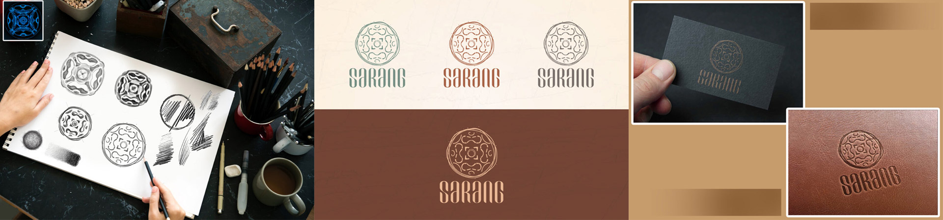
As a firm that believes in creative challenges, we here at Designtheme were thrilled to showcase this visual challenge. Having worked with several indigenous brands before, DTI has always created out-of-the-box design solutions. With our target set on getting the client’s message across in the most visually appealing form, DTI began crafting the unique logo.
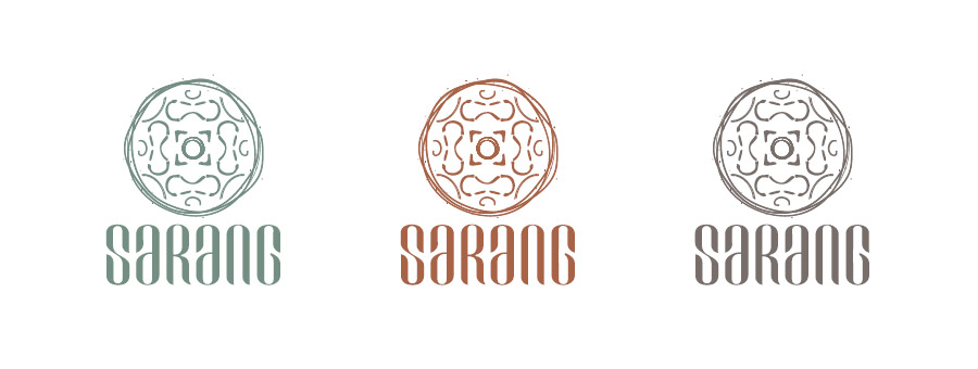
Studio Saarang has three verticals – Architecture, Interior Design, and Furniture. Each vertical needed to be highlighted through the logo. DTI used the principles of brand
architecture to make each vertical stand out in its own way. The concept of brand architecture helped define the color differences for the three verticals.
The task was to visually represent sound aesthetically. The client wanted to use the simplified version of ‘Sa’ the first note of the Sapta Swaras as their logo. DTI worked around that information to develop a unique blend of this traditional musical denotation and the design principles of Saarang. The logo is also needed to justify the architectural qualities of the firm.
Result
After various iterations and brainstorming sessions, DTI was able to deliver a satisfying brand logo that fit all the requirements into one visual. The logo fits perfectly with the client’s thought process and helped in explaining who the company is. With several such positive feedbacks, DTI continues to strive and achieve its goals of delivering market-leading and innovative design solutions.


