- Home
- /
- Case Studies
- /
- SNN Foods
Spice it UP!
Love the sizzle, as you drizzle
Discovering Indian cuisine is like a journey from North Pole to South Pole. The reason why India boasts of thousands of recipes that are healthy with medicinal value is because of its amazing variety of spices and herbs along with a plethora of cooking techniques since ages.
Spices and dried herbs are used throughout the world at all seasons. India is known for its spices and its authentic cuisine has atleast 2 herbs added to the dish prepared.
The journey of SNN Food as a trader was established in the year 1975 by Sri Venkatachalapathy in Kolar district. In 1979 Sri Venkatachalapathy moved to Bangalore and began his wholesale rice shop with the business name NN. Later his two young sons N.V Vinod and N.V Sandeep joined the business and with their dynamic and strategy plans took the business to next level.
As they steadily expanded their business, they started exporting onions and rice under the name SNNE to Sri Lanka, Dubai, Oman, Qatar, Kuwait, and Malaysia. In 2018 they achieved a star export house by govt. of India.
The Challenge
The shift from the brand name NN to SNN especially for spices, snacks and masala products was planned to launch. They wanted to continue their best quality services and value overseas that enhances lifestyle and creates value for their customers through management excellence at all levels.
SNN food wanted to hold their name steady as they are already catering to markets like Oman, Srilanka, Malaysia, Qutar, Kuwait, and Dubai. We had to showcase the new ranges without disturbing the existing product brand name.
 Brand Strategy
 Packaging Design
Solution
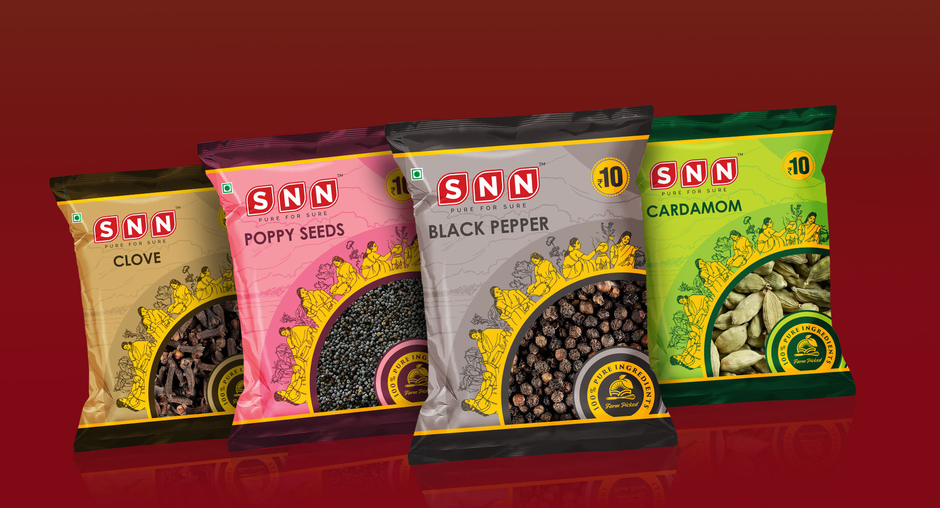
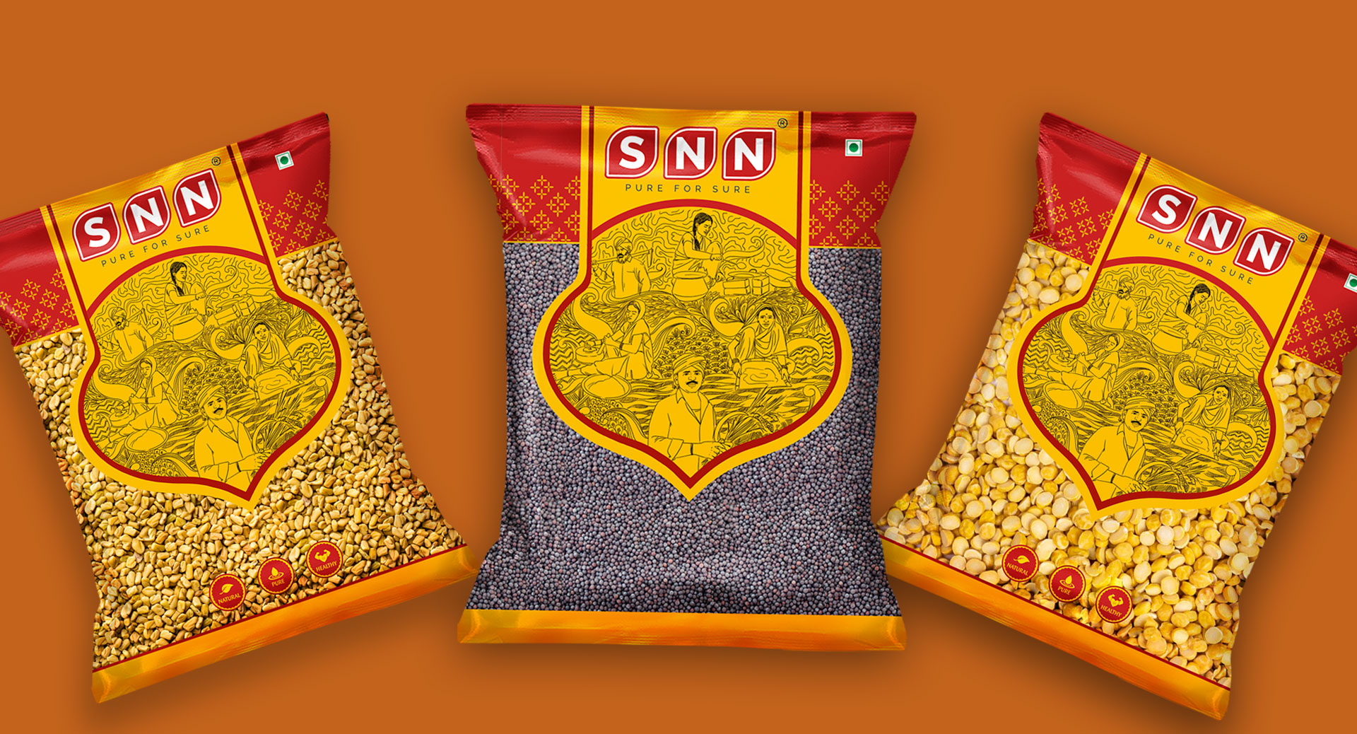
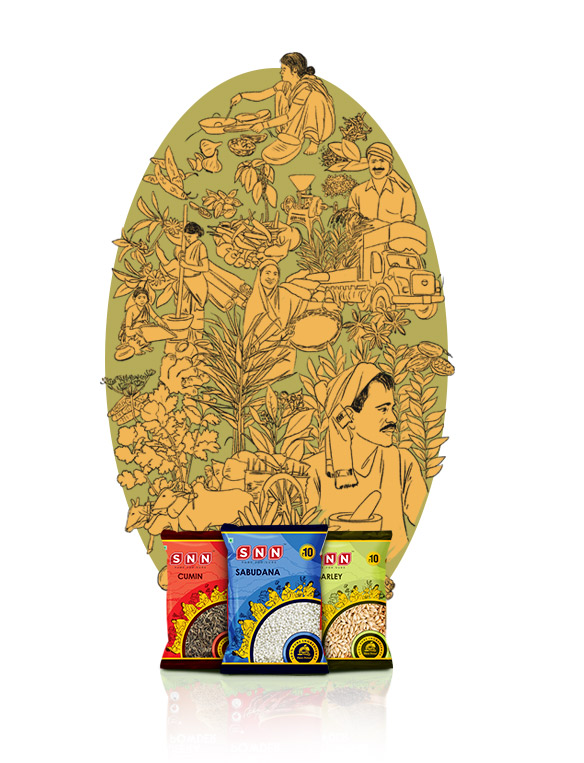
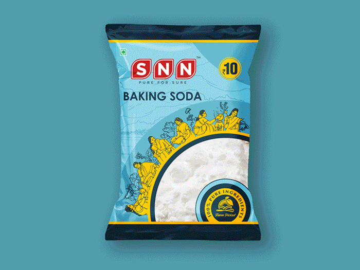
The tradition of spices and the traditional style of handpicking and carefully selecting the spices was showcased in the design. Authentic flavours need authentic style of art.
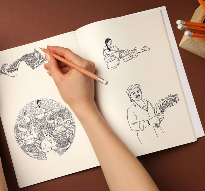
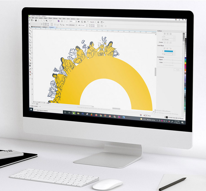
Artists at Designtheme sketched those ladies who handpick, clean and segregate the perfect spice to pack them for the freshness.
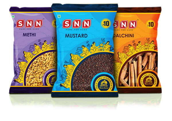
The art work was planned to focus on traditional way of grinding, powdering, cleaning and cooking with earthen pots. The village scene of brining in the richness of hand pound masala is clearly visible in the package.
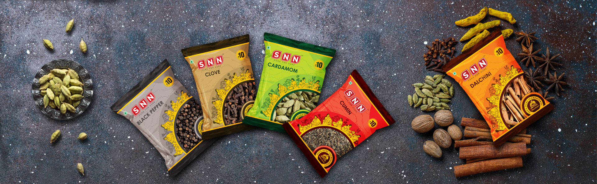
The colours chosen for the package was bright and vibrant as the first cut was planned for 10rs sachet that would usually be hung in a retail outlet. The visual appeal was given to draw attention and stand out from the crowd.

The Result
Packaging print with brilliant colors was achieved. The color tone set for each product was trending that has a competitive edge which helped in brand recall. People recognised their brand and soon the product was talk of the town in tier 2 & tier 3 cities.
Brand positioning and Brand communication was perfectly clear to the target audience. The website was designed in such a way to bring in that look and feel of the spice farm, people engaged in work. The message was clearly delivered and the connection between the brand and the consumer was quick and engaged shooting up sales.